Note
Click here to download the full example code
Tutorial for conformalized quantile regression (CQR)
We will use the sklearn california housing dataset as the base for the
comparison of the different methods available on MAPIE. Two classes will
be used: MapieQuantileRegressor for CQR
and MapieRegressor for the other methods.
For this example, the estimator will be LGBMRegressor with
objective="quantile" as this is a necessary component for CQR, the
regression needs to be from a quantile regressor.
For the conformalized quantile regression (CQR), we will use a split-conformal
method meaning that we will split the training set into a training and
calibration set. This means using
MapieQuantileRegressor with cv="split"
and the alpha parameter already defined. Recall that the alpha is
1 - target coverage.
For the other type of conformal methods, they are chosen with the
parameter method of MapieRegressor and the
parameter cv is the strategy for cross-validation. In this method, to use a
“leave-one-out” strategy, one would have to use cv=-1 where a positive
value would indicate the number of folds for a cross-validation strategy.
Note that for the jackknife+ after boostrap, we need to use the
class Subsample (note that the alpha parameter is
defined in the predict for these methods).
import warnings

import matplotlib.pyplot as plt
import numpy as np
import pandas as pd
from lightgbm import LGBMRegressor
from matplotlib.offsetbox import AnnotationBbox, TextArea
from matplotlib.ticker import FormatStrFormatter
from scipy.stats import randint, uniform
from sklearn.datasets import fetch_california_housing
from sklearn.model_selection import KFold, RandomizedSearchCV, train_test_split

from mapie.metrics import (regression_coverage_score,
                           regression_mean_width_score)
from mapie.regression import MapieQuantileRegressor, MapieRegressor
from mapie.subsample import Subsample

random_state = 18
rng = np.random.default_rng(random_state)
round_to = 3

warnings.filterwarnings("ignore")
1. Data
The target variable of this dataset is the median house value for the California districts. This dataset is composed of 8 features, including variables such as the age of the house, the median income of the neighborhood, the average numbe rooms or bedrooms or even the location in latitude and longitude. In total there are around 20k observations. As the value is expressed in thousands of $ we will multiply it by 100 for better visualization (note that this will not affect the results).
data = fetch_california_housing(as_frame=True)
X = pd.DataFrame(data=data.data, columns=data.feature_names)
y = pd.DataFrame(data=data.target) * 100
Let’s visualize the dataset by showing the correlations between the independent variables.
df = pd.concat([X, y], axis=1)
pear_corr = df.corr(method='pearson')
pear_corr.style.background_gradient(cmap='Greens', axis=0)
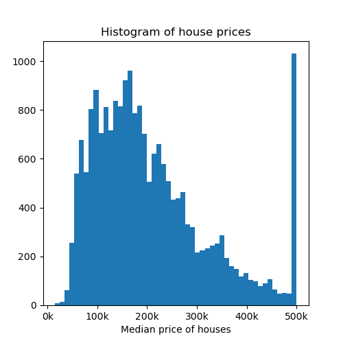
Now let’s visualize a histogram of the price of the houses.
fig, axs = plt.subplots(1, 1, figsize=(5, 5))
axs.hist(y, bins=50)
axs.set_xlabel("Median price of houses")
axs.set_title("Histogram of house prices")
axs.xaxis.set_major_formatter(FormatStrFormatter('%.0f' + "k"))
plt.show()
Let’s now create the different splits for the dataset, with a training, calibration and test set. Recall that the calibration set is used for calibrating the prediction intervals.
X_train, X_test, y_train, y_test = train_test_split(
    X,
    y['MedHouseVal'],
    random_state=random_state
)
X_train, X_calib, y_train, y_calib = train_test_split(
    X_train,
    y_train,
    random_state=random_state
)
2. Optimizing estimator
Before estimating uncertainties, let’s start by optimizing the base model
in order to reduce our prediction error. We will use the
LGBMRegressor in the quantile setting. The optimization
is performed using RandomizedSearchCV
to find the optimal model to predict the house prices.
estimator = LGBMRegressor(
    objective='quantile',
    alpha=0.5,
    random_state=random_state
)
params_distributions = dict(
    num_leaves=randint(low=10, high=50),
    max_depth=randint(low=3, high=20),
    n_estimators=randint(low=50, high=100),
    learning_rate=uniform()
)
optim_model = RandomizedSearchCV(
    estimator,
    param_distributions=params_distributions,
    n_jobs=-1,
    n_iter=10,
    cv=KFold(n_splits=5, shuffle=True),
    verbose=0,
    random_state=random_state
)
optim_model.fit(X_train, y_train)
estimator = optim_model.best_estimator_
3. Comparison of MAPIE methods
We will now proceed to compare the different methods available in MAPIE used for uncertainty quantification on regression settings. For this tutorial we will compare the “naive”, “Jackknife plus after Bootstrap”, “cv plus” and “conformalized quantile regression”. Please have a look at the theoretical description of the documentation for more details on these methods.
We also create two functions, one to sort the dataset in increasing values
of y_test and a plotting function, so that we can plot all predictions
and prediction intervals for different conformal methods.
def sort_y_values(y_test, y_pred, y_pis):
    """
    Sorting the dataset in order to make plots using the fill_between function.
    """
    indices = np.argsort(y_test)
    y_test_sorted = np.array(y_test)[indices]
    y_pred_sorted = y_pred[indices]
    y_lower_bound = y_pis[:, 0, 0][indices]
    y_upper_bound = y_pis[:, 1, 0][indices]
    return y_test_sorted, y_pred_sorted, y_lower_bound, y_upper_bound


def plot_prediction_intervals(
    title,
    axs,
    y_test_sorted,
    y_pred_sorted,
    lower_bound,
    upper_bound,
    coverage,
    width,
    num_plots_idx
):
    """
    Plot of the prediction intervals for each different conformal
    method.
    """
    axs.yaxis.set_major_formatter(FormatStrFormatter('%.0f' + "k"))
    axs.xaxis.set_major_formatter(FormatStrFormatter('%.0f' + "k"))

    lower_bound_ = np.take(lower_bound, num_plots_idx)
    y_pred_sorted_ = np.take(y_pred_sorted, num_plots_idx)
    y_test_sorted_ = np.take(y_test_sorted, num_plots_idx)

    error = y_pred_sorted_-lower_bound_

    warning1 = y_test_sorted_ > y_pred_sorted_+error
    warning2 = y_test_sorted_ < y_pred_sorted_-error
    warnings = warning1 + warning2
    axs.errorbar(
        y_test_sorted_[~warnings],
        y_pred_sorted_[~warnings],
        yerr=np.abs(error[~warnings]),
        capsize=5, marker="o", elinewidth=2, linewidth=0,
        label="Inside prediction interval"
        )
    axs.errorbar(
        y_test_sorted_[warnings],
        y_pred_sorted_[warnings],
        yerr=np.abs(error[warnings]),
        capsize=5, marker="o", elinewidth=2, linewidth=0, color="red",
        label="Outside prediction interval"
        )
    axs.scatter(
        y_test_sorted_[warnings],
        y_test_sorted_[warnings],
        marker="*", color="green",
        label="True value"
    )
    axs.set_xlabel("True house prices in $")
    axs.set_ylabel("Prediction of house prices in $")
    ab = AnnotationBbox(
        TextArea(
            f"Coverage: {np.round(coverage, round_to)}\n"
            + f"Interval width: {np.round(width, round_to)}"
        ),
        xy=(np.min(y_test_sorted_)*3, np.max(y_pred_sorted_+error)*0.95),
        )
    lims = [
        np.min([axs.get_xlim(), axs.get_ylim()]),  # min of both axes
        np.max([axs.get_xlim(), axs.get_ylim()]),  # max of both axes
    ]
    axs.plot(lims, lims, '--', alpha=0.75, color="black", label="x=y")
    axs.add_artist(ab)
    axs.set_title(title, fontweight='bold')
We proceed to using MAPIE to return the predictions and prediction intervals.
We will use an  , this means a target coverage of 0.8
(recall that this parameter needs to be initialized directly when setting
, this means a target coverage of 0.8
(recall that this parameter needs to be initialized directly when setting
MapieQuantileRegressor and when using
MapieRegressor, it needs to be set in the
predict).
Note that for the CQR, there are two options for cv:
cv="split"(by default), the split-conformal where MAPIE trains the model on a training set and then calibrates on the calibration set.cv="prefit"meaning that you can train your models with the correct quantile values (must be given in the following order: and given to MAPIE as an iterable
object. (Check the examples for how to use prefit in MAPIE)
and given to MAPIE as an iterable
object. (Check the examples for how to use prefit in MAPIE)
Additionally, note that there is a list of accepted models by
MapieQuantileRegressor
(quantile_estimator_params) and that we will use symmetrical residuals.
STRATEGIES = {
    "naive": {"method": "naive"},
    "cv_plus": {"method": "plus", "cv": 10},
    "jackknife_plus_ab": {"method": "plus", "cv": Subsample(n_resamplings=50)},
    "cqr": {"method": "quantile", "cv": "split", "alpha": 0.2},
}
y_pred, y_pis = {}, {}
y_test_sorted, y_pred_sorted, lower_bound, upper_bound = {}, {}, {}, {}
coverage, width = {}, {}
for strategy, params in STRATEGIES.items():
    if strategy == "cqr":
        mapie = MapieQuantileRegressor(estimator, **params)
        mapie.fit(
            X_train, y_train,
            X_calib=X_calib, y_calib=y_calib,
            random_state=random_state
        )
        y_pred[strategy], y_pis[strategy] = mapie.predict(X_test)
    else:
        mapie = MapieRegressor(estimator, **params, random_state=random_state)
        mapie.fit(X_train, y_train)
        y_pred[strategy], y_pis[strategy] = mapie.predict(X_test, alpha=0.2)
    (
        y_test_sorted[strategy],
        y_pred_sorted[strategy],
        lower_bound[strategy],
        upper_bound[strategy]
    ) = sort_y_values(y_test, y_pred[strategy], y_pis[strategy])
    coverage[strategy] = regression_coverage_score(
        y_test,
        y_pis[strategy][:, 0, 0],
        y_pis[strategy][:, 1, 0]
        )
    width[strategy] = regression_mean_width_score(
        y_pis[strategy][:, 0, 0],
        y_pis[strategy][:, 1, 0]
        )
We will now proceed to the plotting stage, note that we only plot 2% of the observations in order to not crowd the plot too much.
perc_obs_plot = 0.02
num_plots = rng.choice(
    len(y_test), int(perc_obs_plot*len(y_test)), replace=False
    )
fig, axs = plt.subplots(2, 2, figsize=(15, 13))
coords = [axs[0, 0], axs[0, 1], axs[1, 0], axs[1, 1]]
for strategy, coord in zip(STRATEGIES.keys(), coords):
    plot_prediction_intervals(
        strategy,
        coord,
        y_test_sorted[strategy],
        y_pred_sorted[strategy],
        lower_bound[strategy],
        upper_bound[strategy],
        coverage[strategy],
        width[strategy],
        num_plots
        )
lines_labels = [ax.get_legend_handles_labels() for ax in fig.axes]
lines, labels = [sum(_, []) for _ in zip(*lines_labels)]
plt.legend(
    lines[:4], labels[:4],
    loc='upper center',
    bbox_to_anchor=(0, -0.15),
    fancybox=True,
    shadow=True,
    ncol=2
)
plt.show()
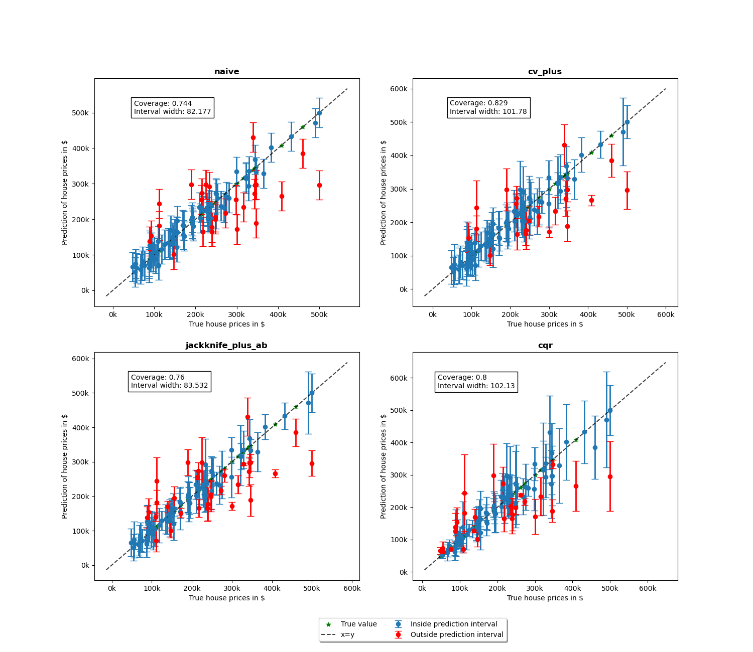
We notice more adaptability of the prediction intervals for the conformalized quantile regression while the other methods have fixed interval width. Indeed, as the prices get larger, the prediction intervals are increased with the increase in price.
def get_coverages_widths_by_bins(
    want,
    y_test,
    y_pred,
    lower_bound,
    upper_bound,
    STRATEGIES,
    bins
):
    """
    Given the results from MAPIE, this function split the data
    according the the test values into bins and calculates coverage
    or width per bin.
    """
    cuts = []
    cuts_ = pd.qcut(y_test["naive"], bins).unique()[:-1]
    for item in cuts_:
        cuts.append(item.left)
    cuts.append(cuts_[-1].right)
    cuts.append(np.max(y_test["naive"])+1)
    recap = {}
    for i in range(len(cuts) - 1):
        cut1, cut2 = cuts[i], cuts[i+1]
        name = f"[{np.round(cut1, 0)}, {np.round(cut2, 0)}]"
        recap[name] = []
        for strategy in STRATEGIES:
            indices = np.where(
                (y_test[strategy] > cut1) * (y_test[strategy] <= cut2)
                )
            y_test_trunc = np.take(y_test[strategy], indices)
            y_low_ = np.take(lower_bound[strategy], indices)
            y_high_ = np.take(upper_bound[strategy], indices)
            if want == "coverage":
                recap[name].append(regression_coverage_score(
                    y_test_trunc[0],
                    y_low_[0],
                    y_high_[0]
                ))
            elif want == "width":
                recap[name].append(
                    regression_mean_width_score(y_low_[0], y_high_[0])
                )
    recap_df = pd.DataFrame(recap, index=STRATEGIES)
    return recap_df


bins = list(np.arange(0, 1, 0.1))
binned_data = get_coverages_widths_by_bins(
    "coverage",
    y_test_sorted,
    y_pred_sorted,
    lower_bound,
    upper_bound,
    STRATEGIES,
    bins
)
To confirm these insights, we will now observe what happens when we plot the conditional coverage and interval width on these intervals splitted by quantiles.
binned_data.T.plot.bar(figsize=(12, 4))
plt.axhline(0.80, ls="--", color="k")
plt.ylabel("Conditional coverage")
plt.xlabel("Binned house prices")
plt.xticks(rotation=345)
plt.ylim(0.3, 1.0)
plt.legend(loc=[1, 0])
plt.show()
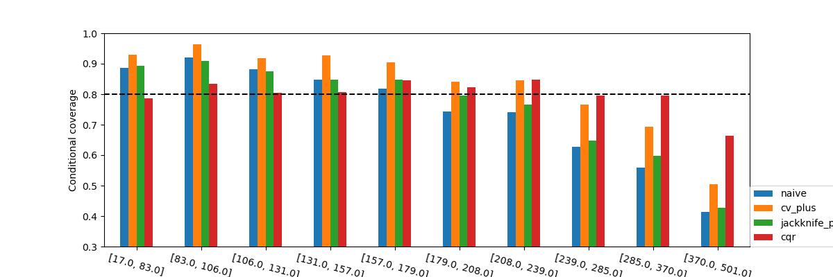
What we observe from these results is that none of the methods seems to
have conditional coverage at the target  . However, we can
clearly notice that the CQR seems to better adapt to large prices. Its
conditional coverage is closer to the target coverage not only for higher
prices, but also for lower prices where the other methods have a higher
coverage than needed. This will very likely have an impact on the widths
of the intervals.
. However, we can
clearly notice that the CQR seems to better adapt to large prices. Its
conditional coverage is closer to the target coverage not only for higher
prices, but also for lower prices where the other methods have a higher
coverage than needed. This will very likely have an impact on the widths
of the intervals.
binned_data = get_coverages_widths_by_bins(
    "width",
    y_test_sorted,
    y_pred_sorted,
    lower_bound,
    upper_bound,
    STRATEGIES,
    bins
)


binned_data.T.plot.bar(figsize=(12, 4))
plt.ylabel("Interval width")
plt.xlabel("Binned house prices")
plt.xticks(rotation=350)
plt.legend(loc=[1, 0])
plt.show()
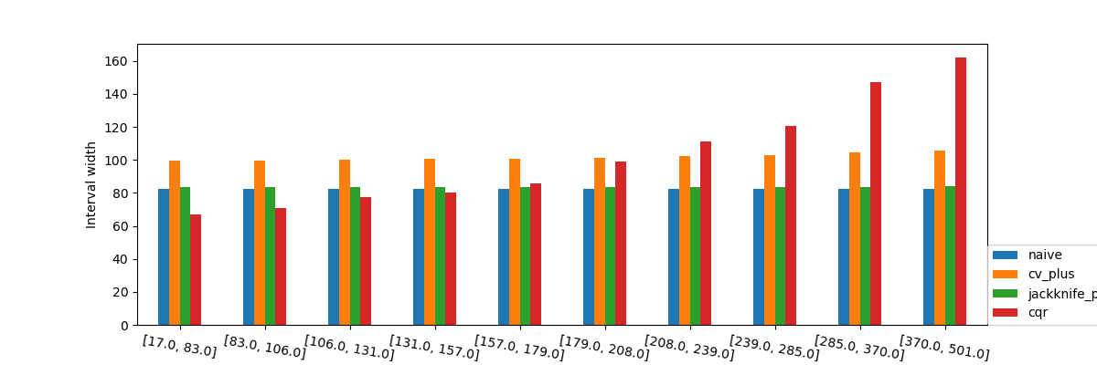
When observing the values of the the interval width we again see what was observed in the previous graphs with the interval widths. We can again see that the prediction intervals are larger as the price of the houses increases, interestingly, it’s important to note that the prediction intervals are shorter when the estimator is more certain.
Total running time of the script: ( 0 minutes 21.873 seconds)