Note
Click here to download the full example code
Tutorial for tabular regression
In this tutorial, we compare the prediction intervals estimated by MAPIE on a
simple, one-dimensional, ground truth function
 .
.
Throughout this tutorial, we will answer the following questions:
How well do the MAPIE strategies capture the aleatoric uncertainty existing in the data?
How do the prediction intervals estimated by the resampling strategies evolve for new out-of-distribution data ?
How do the prediction intervals vary between regressor models ?
Throughout this tutorial, we estimate the prediction intervals first using a polynomial function, and then using a boosting model, and a simple neural network.
For practical problems, we advise using the faster CV+ or Jackknife+-after-Bootstrap strategies. For conservative prediction interval estimates, you can alternatively use the CV-minmax strategies.
import os
import warnings

import matplotlib.pyplot as plt
import numpy as np
import pandas as pd
from sklearn.linear_model import LinearRegression, QuantileRegressor
from sklearn.pipeline import Pipeline
from sklearn.preprocessing import PolynomialFeatures

from mapie.metrics import regression_coverage_score
from mapie.regression import MapieQuantileRegressor, MapieRegressor
from mapie.subsample import Subsample

os.environ["TF_CPP_MIN_LOG_LEVEL"] = "3"
warnings.filterwarnings("ignore")
1. Estimating the aleatoric uncertainty of homoscedastic noisy data
Let’s start by defining the  function and another
simple function that generates one-dimensional data with normal noise
uniformely in a given interval.
function and another
simple function that generates one-dimensional data with normal noise
uniformely in a given interval.
def x_sinx(x):
    """One-dimensional x*sin(x) function."""
    return x*np.sin(x)


def get_1d_data_with_constant_noise(funct, min_x, max_x, n_samples, noise):
    """
    Generate 1D noisy data uniformely from the given function
    and standard deviation for the noise.
    """
    np.random.seed(59)
    X_train = np.linspace(min_x, max_x, n_samples)
    np.random.shuffle(X_train)
    X_test = np.linspace(min_x, max_x, n_samples*5)
    y_train, y_mesh, y_test = funct(X_train), funct(X_test), funct(X_test)
    y_train += np.random.normal(0, noise, y_train.shape[0])
    y_test += np.random.normal(0, noise, y_test.shape[0])
    return (
        X_train.reshape(-1, 1), y_train, X_test.reshape(-1, 1), y_test, y_mesh
    )
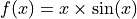
We first generate noisy one-dimensional data uniformely on an interval.
Here, the noise is considered as homoscedastic, since it remains constant
over  .
.
Let’s visualize our noisy function.
plt.xlabel("x")
plt.ylabel("y")
plt.scatter(X_train, y_train, color="C0")
_ = plt.plot(X_test, y_mesh, color="C1")
plt.show()
As mentioned previously, we fit our training data with a simple
polynomial function. Here, we choose a degree equal to 10 so the function
is able to perfectly fit .
degree_polyn = 10
polyn_model = Pipeline(
    [
        ("poly", PolynomialFeatures(degree=degree_polyn)),
        ("linear", LinearRegression())
    ]
)
polyn_model_quant = Pipeline(
    [
        ("poly", PolynomialFeatures(degree=degree_polyn)),
        ("linear", QuantileRegressor(
                solver="highs",
                alpha=0,
        ))
    ]
)
We then estimate the prediction intervals for all the strategies very easily with a fit and predict process. The prediction interval’s lower and upper bounds are then saved in a DataFrame. Here, we set an alpha value of 0.05 in order to obtain a 95% confidence for our prediction intervals.
STRATEGIES = {
    "naive": dict(method="naive"),
    "jackknife": dict(method="base", cv=-1),
    "jackknife_plus": dict(method="plus", cv=-1),
    "jackknife_minmax": dict(method="minmax", cv=-1),
    "cv": dict(method="base", cv=10),
    "cv_plus": dict(method="plus", cv=10),
    "cv_minmax": dict(method="minmax", cv=10),
    "jackknife_plus_ab": dict(method="plus", cv=Subsample(n_resamplings=50)),
    "jackknife_minmax_ab": dict(
        method="minmax", cv=Subsample(n_resamplings=50)
    ),
    "conformalized_quantile_regression": dict(
        method="quantile", cv="split", alpha=0.05
    )
}
y_pred, y_pis = {}, {}
for strategy, params in STRATEGIES.items():
    if strategy == "conformalized_quantile_regression":
        mapie = MapieQuantileRegressor(polyn_model_quant, **params)
        mapie.fit(X_train, y_train, random_state=1)
        y_pred[strategy], y_pis[strategy] = mapie.predict(X_test)
    else:
        mapie = MapieRegressor(polyn_model, **params)
        mapie.fit(X_train, y_train)
        y_pred[strategy], y_pis[strategy] = mapie.predict(X_test, alpha=0.05)
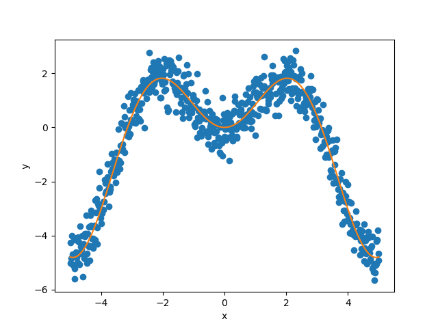
Let’s now compare the target confidence intervals with the predicted
intervals obtained with the Jackknife+, Jackknife-minmax, CV+, CV-minmax,
Jackknife+-after-Boostrap, and conformalized quantile regression (CQR)
strategies. Note that for the Jackknife-after-Bootstrap method, we call the
Subsample object that allows us to train
bootstrapped models. Note also that the CQR method is called with
MapieQuantileRegressor with a
“split” strategy.
def plot_1d_data(
    X_train,
    y_train,
    X_test,
    y_test,
    y_sigma,
    y_pred,
    y_pred_low,
    y_pred_up,
    ax=None,
    title=None
):
    ax.set_xlabel("x")
    ax.set_ylabel("y")
    ax.fill_between(X_test, y_pred_low, y_pred_up, alpha=0.3)
    ax.scatter(X_train, y_train, color="red", alpha=0.3, label="Training data")
    ax.plot(X_test, y_test, color="gray", label="True confidence intervals")
    ax.plot(X_test, y_test - y_sigma, color="gray", ls="--")
    ax.plot(X_test, y_test + y_sigma, color="gray", ls="--")
    ax.plot(
        X_test, y_pred, color="blue", alpha=0.5, label="Prediction intervals"
    )
    if title is not None:
        ax.set_title(title)
    ax.legend()


strategies = [
    "jackknife_plus",
    "jackknife_minmax",
    "cv_plus",
    "cv_minmax",
    "jackknife_plus_ab",
    "conformalized_quantile_regression"
]
n_figs = len(strategies)
fig, axs = plt.subplots(3, 2, figsize=(9, 13))
coords = [axs[0, 0], axs[0, 1], axs[1, 0], axs[1, 1], axs[2, 0], axs[2, 1]]
for strategy, coord in zip(strategies, coords):
    plot_1d_data(
        X_train.ravel(),
        y_train.ravel(),
        X_test.ravel(),
        y_mesh.ravel(),
        np.full((X_test.shape[0]), 1.96*noise).ravel(),
        y_pred[strategy].ravel(),
        y_pis[strategy][:, 0, 0].ravel(),
        y_pis[strategy][:, 1, 0].ravel(),
        ax=coord,
        title=strategy
    )
plt.show()
At first glance, the four strategies give similar results and the
prediction intervals are very close to the true confidence intervals.
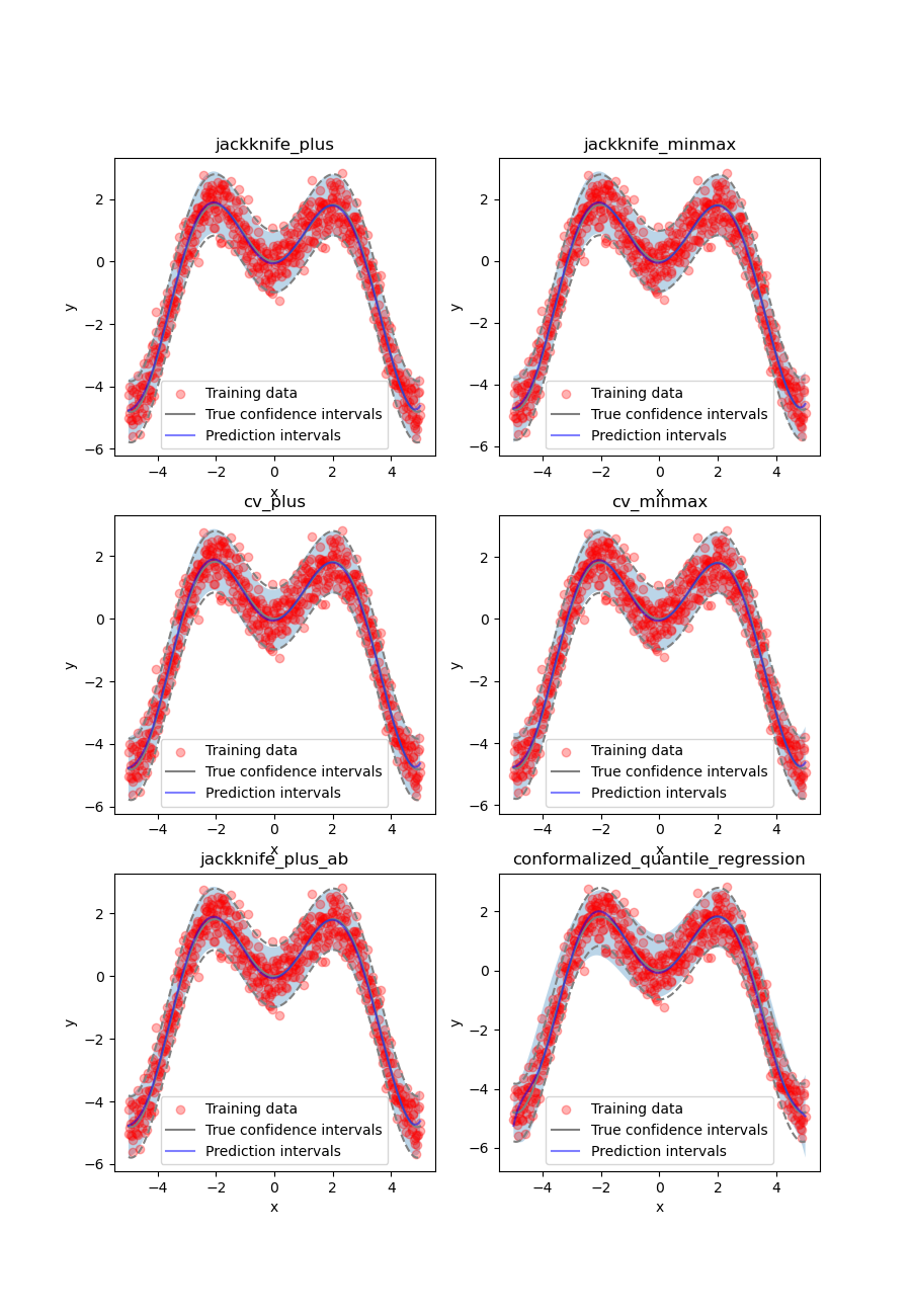
Let’s confirm this by comparing the prediction interval widths over
between all strategies.
fig, ax = plt.subplots(1, 1, figsize=(9, 5))
ax.axhline(1.96*2*noise, ls="--", color="k", label="True width")
for strategy in STRATEGIES:
    ax.plot(
        X_test,
        y_pis[strategy][:, 1, 0] - y_pis[strategy][:, 0, 0],
        label=strategy
    )
ax.set_xlabel("x")
ax.set_ylabel("Prediction Interval Width")
ax.legend(fontsize=8)
plt.show()
As expected, the prediction intervals estimated by the Naive method are slightly too narrow. The Jackknife, Jackknife+, CV, CV+, JaB, and J+aB give similar widths that are very close to the true width. On the other hand, the width estimated by Jackknife-minmax and CV-minmax are slightly too wide. Note that the widths given by the Naive, Jackknife, and CV strategies are constant because there is a single model used for prediction, perturbed models are ignored at prediction time.
It’s interesting to observe that CQR strategy offers more varying width, often giving much higher but also lower interval width than other methods, therefore, with homoscedastic noise, CQR would not be the preferred method.
Let’s now compare the effective coverage, namely the fraction of test points whose true values lie within the prediction intervals, given by the different strategies.
pd.DataFrame([
    [
        regression_coverage_score(
            y_test, y_pis[strategy][:, 0, 0], y_pis[strategy][:, 1, 0]
        ),
        (
            y_pis[strategy][:, 1, 0] - y_pis[strategy][:, 0, 0]
        ).mean()
    ] for strategy in STRATEGIES
], index=STRATEGIES, columns=["Coverage", "Width average"]).round(2)
All strategies except the Naive one give effective coverage close to the expected 0.95 value (recall that alpha = 0.05), confirming the theoretical garantees.
2. Estimating the aleatoric uncertainty of heteroscedastic noisy data
Let’s define again the function and another simple
function that generates one-dimensional data with normal noise uniformely
in a given interval.
def get_1d_data_with_heteroscedastic_noise(
    funct, min_x, max_x, n_samples, noise
):
    """
    Generate 1D noisy data uniformely from the given function
    and standard deviation for the noise.
    """
    np.random.seed(59)
    X_train = np.linspace(min_x, max_x, n_samples)
    np.random.shuffle(X_train)
    X_test = np.linspace(min_x, max_x, n_samples*5)
    y_train = (
        funct(X_train) +
        (np.random.normal(0, noise, len(X_train)) * X_train)
    )
    y_test = (
        funct(X_test) +
        (np.random.normal(0, noise, len(X_test)) * X_test)
    )
    y_mesh = funct(X_test)
    return (
        X_train.reshape(-1, 1), y_train, X_test.reshape(-1, 1), y_test, y_mesh
    )
We first generate noisy one-dimensional data uniformely on an interval.
Here, the noise is considered as heteroscedastic, since it will increase
linearly with .
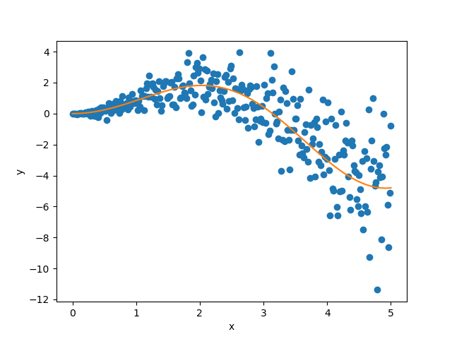
Let’s visualize our noisy function. As x increases, the data becomes more noisy.
plt.xlabel("x")
plt.ylabel("y")
plt.scatter(X_train, y_train, color="C0")
plt.plot(X_test, y_mesh, color="C1")
plt.show()
As mentioned previously, we fit our training data with a simple
polynomial function. Here, we choose a degree equal to 10 so the function
is able to perfectly fit .
degree_polyn = 10
polyn_model = Pipeline(
    [
        ("poly", PolynomialFeatures(degree=degree_polyn)),
        ("linear", LinearRegression())
    ]
)
polyn_model_quant = Pipeline(
    [
        ("poly", PolynomialFeatures(degree=degree_polyn)),
        ("linear", QuantileRegressor(
                solver="highs",
                alpha=0,
        ))
    ]
)
We then estimate the prediction intervals for all the strategies very easily with a fit and predict process. The prediction interval’s lower and upper bounds are then saved in a DataFrame. Here, we set an alpha value of 0.05 in order to obtain a 95% confidence for our prediction intervals.
STRATEGIES = {
    "naive": dict(method="naive"),
    "jackknife": dict(method="base", cv=-1),
    "jackknife_plus": dict(method="plus", cv=-1),
    "jackknife_minmax": dict(method="minmax", cv=-1),
    "cv": dict(method="base", cv=10),
    "cv_plus": dict(method="plus", cv=10),
    "cv_minmax": dict(method="minmax", cv=10),
    "jackknife_plus_ab": dict(method="plus", cv=Subsample(n_resamplings=50)),
    "conformalized_quantile_regression": dict(
        method="quantile", cv="split", alpha=0.05
    )
}
y_pred, y_pis = {}, {}
for strategy, params in STRATEGIES.items():
    if strategy == "conformalized_quantile_regression":
        mapie = MapieQuantileRegressor(polyn_model_quant, **params)
        mapie.fit(X_train, y_train, random_state=1)
        y_pred[strategy], y_pis[strategy] = mapie.predict(X_test)
    else:
        mapie = MapieRegressor(polyn_model, **params)
        mapie.fit(X_train, y_train)
        y_pred[strategy], y_pis[strategy] = mapie.predict(X_test, alpha=0.05)
Once again, let’s compare the target confidence intervals with prediction intervals obtained with the Jackknife+, Jackknife-minmax, CV+, CV-minmax, Jackknife+-after-Boostrap, and CQR strategies.
strategies = [
    "jackknife_plus",
    "jackknife_minmax",
    "cv_plus",
    "cv_minmax",
    "jackknife_plus_ab",
    "conformalized_quantile_regression"
]
n_figs = len(strategies)
fig, axs = plt.subplots(3, 2, figsize=(9, 13))
coords = [axs[0, 0], axs[0, 1], axs[1, 0], axs[1, 1], axs[2, 0], axs[2, 1]]
for strategy, coord in zip(strategies, coords):
    plot_1d_data(
        X_train.ravel(),
        y_train.ravel(),
        X_test.ravel(),
        y_mesh.ravel(),
        (1.96*noise*X_test).ravel(),
        y_pred[strategy].ravel(),
        y_pis[strategy][:, 0, 0].ravel(),
        y_pis[strategy][:, 1, 0].ravel(),
        ax=coord,
        title=strategy
    )
plt.show()
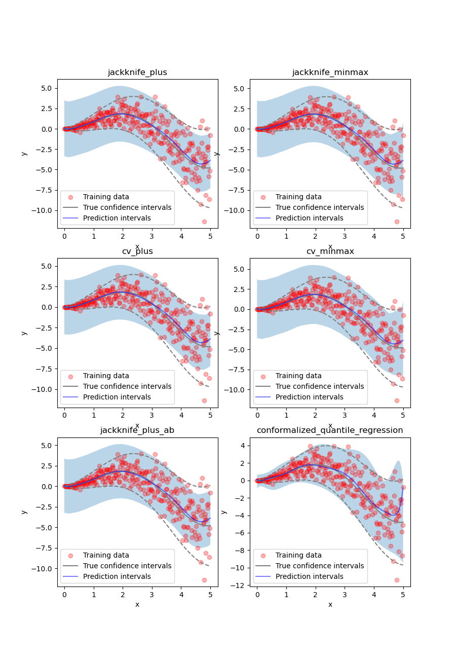
We can observe that all of the strategies except CQR seem to have similar constant prediction intervals. On the other hand, the CQR strategy offers a solution that adapts the prediction intervals to the local noise.
fig, ax = plt.subplots(1, 1, figsize=(7, 5))
ax.plot(X_test, 1.96*2*noise*X_test, ls="--", color="k", label="True width")
for strategy in STRATEGIES:
    ax.plot(
        X_test,
        y_pis[strategy][:, 1, 0] - y_pis[strategy][:, 0, 0],
        label=strategy
    )
ax.set_xlabel("x")
ax.set_ylabel("Prediction Interval Width")
ax.legend(fontsize=8)
plt.show()
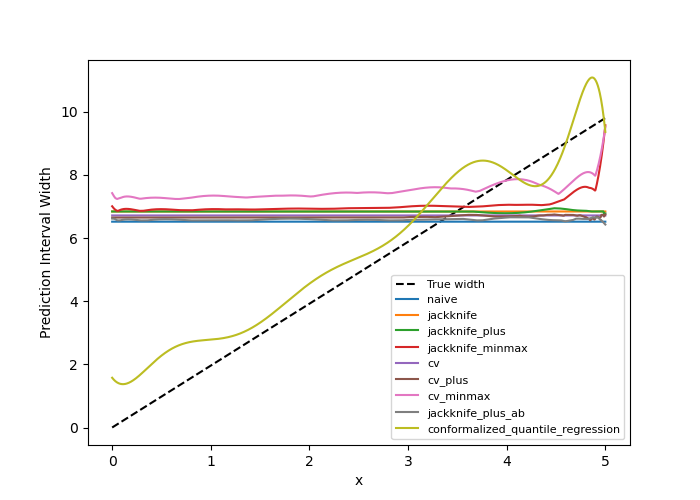
One can observe that all the strategies behave in a similar way as in the
first example shown previously. One exception is the CQR method which takes
into account the heteroscedasticity of the data. In this method we observe
very low interval widths at low values of .
This is the only method that
even slightly follows the true width, and therefore is the preferred method
for heteroscedastic data. Notice also that the true width is greater (lower)
than the predicted width from the other methods at  (
( ). This means that while the marginal coverage correct for
these methods, the conditional coverage is likely not guaranteed as we will
observe in the next figure.
). This means that while the marginal coverage correct for
these methods, the conditional coverage is likely not guaranteed as we will
observe in the next figure.
def get_heteroscedastic_coverage(y_test, y_pis, STRATEGIES, bins):
recap = {}
for i in range(len(bins)-1):
bin1, bin2 = bins[i], bins[i+1]
name = f"[{bin1}, {bin2}]"
recap[name] = []
for strategy in STRATEGIES:
indices = np.where((X_test >= bins[i]) * (X_test <= bins[i+1]))
y_test_trunc = np.take(y_test, indices)
y_low_ = np.take(y_pis[strategy][:, 0, 0], indices)
y_high_ = np.take(y_pis[strategy][:, 1, 0], indices)
score_coverage = regression_coverage_score(
y_test_trunc[0], y_low_[0], y_high_[0]
)
recap[name].append(score_coverage)
recap_df = pd.DataFrame(recap, index=STRATEGIES)
return recap_df
bins = [0, 1, 2, 3, 4, 5]
heteroscedastic_coverage = get_heteroscedastic_coverage(
y_test, y_pis, STRATEGIES, bins
)
# fig = plt.figure()
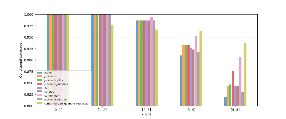
heteroscedastic_coverage.T.plot.bar(figsize=(12, 5), alpha=0.7)
plt.axhline(0.95, ls="--", color="k")
plt.ylabel("Conditional coverage")
plt.xlabel("x bins")
plt.xticks(rotation=0)
plt.ylim(0.8, 1.0)
plt.legend(fontsize=8, loc=[0, 0])
plt.show()
Let’s now conclude by summarizing the effective coverage, namely the fraction of test points whose true values lie within the prediction intervals, given by the different strategies.
pd.DataFrame([
    [
        regression_coverage_score(
            y_test, y_pis[strategy][:, 0, 0], y_pis[strategy][:, 1, 0]
        ),
        (
            y_pis[strategy][:, 1, 0] - y_pis[strategy][:, 0, 0]
        ).mean()
    ] for strategy in STRATEGIES
], index=STRATEGIES, columns=["Coverage", "Width average"]).round(2)
All the strategies have the wanted coverage, however, we notice that the CQR strategy has much lower interval width than all the other methods, therefore, with heteroscedastic noise, CQR would be the preferred method.
3. Estimating the epistemic uncertainty of out-of-distribution data
Let’s now consider one-dimensional data without noise, but normally distributed. The goal is to explore how the prediction intervals evolve for new data that lie outside the distribution of the training data in order to see how the strategies can capture the epistemic uncertainty. For a comparison of the epistemic and aleatoric uncertainties, please have a look at this source: https://en.wikipedia.org/wiki/Uncertainty_quantification.
Let’s start by generating and showing the data.
def get_1d_data_with_normal_distrib(funct, mu, sigma, n_samples, noise):
"""
Generate noisy 1D data with normal distribution from given function
and noise standard deviation.
"""
np.random.seed(59)
X_train = np.random.normal(mu, sigma, n_samples)
X_test = np.arange(mu-4*sigma, mu+4*sigma, sigma/20.)
y_train, y_mesh, y_test = funct(X_train), funct(X_test), funct(X_test)
y_train += np.random.normal(0, noise, y_train.shape[0])
y_test += np.random.normal(0, noise, y_test.shape[0])
return (
X_train.reshape(-1, 1), y_train, X_test.reshape(-1, 1), y_test, y_mesh
)
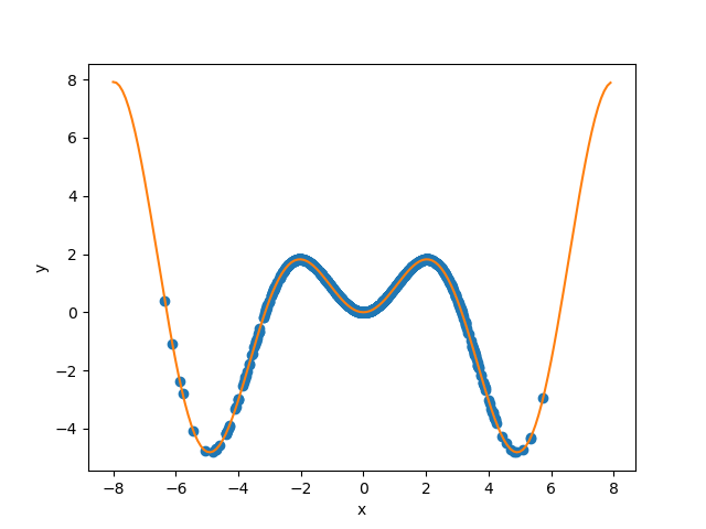
mu, sigma, n_samples, noise = 0, 2, 1000, 0.
X_train, y_train, X_test, y_test, y_mesh = get_1d_data_with_normal_distrib(
x_sinx, mu, sigma, n_samples, noise
)
plt.xlabel("x")
plt.ylabel("y")
plt.scatter(X_train, y_train, color="C0")
_ = plt.plot(X_test, y_test, color="C1")
plt.show()
As before, we estimate the prediction intervals using a polynomial function of degree 10 and show the results for the Jackknife+ and CV+ strategies.
polyn_model_quant = Pipeline(
    [
        ("poly", PolynomialFeatures(degree=degree_polyn)),
        ("linear", QuantileRegressor(
                solver="highs-ds",
                alpha=0,
        ))
    ]
)
STRATEGIES = {
    "naive": dict(method="naive"),
    "jackknife": dict(method="base", cv=-1),
    "jackknife_plus": dict(method="plus", cv=-1),
    "jackknife_minmax": dict(method="minmax", cv=-1),
    "cv": dict(method="base", cv=10),
    "cv_plus": dict(method="plus", cv=10),
    "cv_minmax": dict(method="minmax", cv=10),
    "jackknife_plus_ab": dict(method="plus", cv=Subsample(n_resamplings=50)),
    "jackknife_minmax_ab": dict(
        method="minmax", cv=Subsample(n_resamplings=50)
    ),
    "conformalized_quantile_regression": dict(
        method="quantile", cv="split", alpha=0.05
    )
}
y_pred, y_pis = {}, {}
for strategy, params in STRATEGIES.items():
    if strategy == "conformalized_quantile_regression":
        mapie = MapieQuantileRegressor(polyn_model_quant, **params)
        mapie.fit(X_train, y_train, random_state=1)
        y_pred[strategy], y_pis[strategy] = mapie.predict(X_test)
    else:
        mapie = MapieRegressor(polyn_model, **params)
        mapie.fit(X_train, y_train)
        y_pred[strategy], y_pis[strategy] = mapie.predict(X_test, alpha=0.05)

strategies = [
    "jackknife_plus",
    "jackknife_minmax",
    "cv_plus",
    "cv_minmax",
    "jackknife_plus_ab",
    "conformalized_quantile_regression"
]
n_figs = len(strategies)
fig, axs = plt.subplots(3, 2, figsize=(9, 13))
coords = [axs[0, 0], axs[0, 1], axs[1, 0], axs[1, 1], axs[2, 0], axs[2, 1]]
for strategy, coord in zip(strategies, coords):
    plot_1d_data(
        X_train.ravel(),
        y_train.ravel(),
        X_test.ravel(),
        y_mesh.ravel(),
        1.96*noise,
        y_pred[strategy].ravel(),
        y_pis[strategy][:, 0, :].ravel(),
        y_pis[strategy][:, 1, :].ravel(),
        ax=coord,
        title=strategy
    )
plt.show()
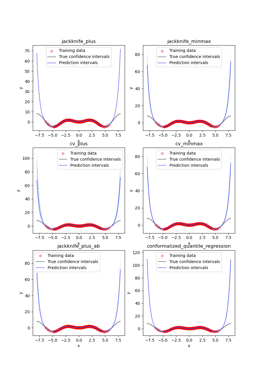
At first glance, our polynomial function does not give accurate
predictions with respect to the true function when  .
The prediction intervals estimated with the Jackknife+ do not seem to
increase. On the other hand, the CV and other related methods seem to capture
some uncertainty when
.
The prediction intervals estimated with the Jackknife+ do not seem to
increase. On the other hand, the CV and other related methods seem to capture
some uncertainty when  .
.
Let’s now compare the prediction interval widths between all strategies.
fig, ax = plt.subplots(1, 1, figsize=(7, 5))
ax.set_yscale("log")
for strategy in STRATEGIES:
    ax.plot(
        X_test,
        y_pis[strategy][:, 1, 0] - y_pis[strategy][:, 0, 0],
        label=strategy
    )
ax.set_xlabel("x")
ax.set_ylabel("Prediction Interval Width")
ax.legend(fontsize=8)
plt.show()
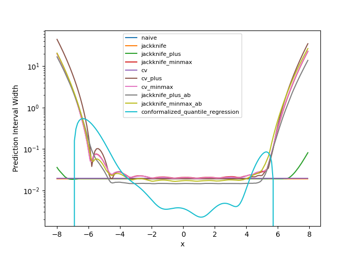
The prediction interval widths start to increase exponentially
for  for the CV+, CV-minmax, Jackknife-minmax, and quantile
strategies. On the other hand, the prediction intervals estimated by
Jackknife+ remain roughly constant until
for the CV+, CV-minmax, Jackknife-minmax, and quantile
strategies. On the other hand, the prediction intervals estimated by
Jackknife+ remain roughly constant until  before
increasing.
The CQR strategy seems to perform well, however, on the extreme values
of the data the quantile regression fails to give reliable results as it
outputs
negative value for the prediction intervals. This occurs because the quantile
regressor with quantile
before
increasing.
The CQR strategy seems to perform well, however, on the extreme values
of the data the quantile regression fails to give reliable results as it
outputs
negative value for the prediction intervals. This occurs because the quantile
regressor with quantile  gives higher values than the
quantile regressor with quantile
gives higher values than the
quantile regressor with quantile  . Note that a warning will
be issued when this occurs.
. Note that a warning will
be issued when this occurs.
pd.DataFrame([
    [
        regression_coverage_score(
            y_test, y_pis[strategy][:, 0, 0], y_pis[strategy][:, 1, 0]
        ),
        (
            y_pis[strategy][:, 1, 0] - y_pis[strategy][:, 0, 0]
        ).mean()
    ] for strategy in STRATEGIES
], index=STRATEGIES, columns=["Coverage", "Width average"]).round(3)
In conclusion, the Jackknife-minmax, CV+, CV-minmax, or Jackknife-minmax-ab strategies are more conservative than the Jackknife+ strategy, and tend to result in more reliable coverages for out-of-distribution data. It is therefore advised to use the three former strategies for predictions with new out-of-distribution data. Note however that there are no theoretical guarantees on the coverage level for out-of-distribution data. Here it’s important to note that the CQR strategy should not be taken into account for width prediction, and it is abundantly clear from the negative width coverage that is observed in these results.
4. More Jupyter notebooks for regression
If you would like to run a series of notebooks hosted on the MAPIE Github repository that can be run on Google Colab, please visit this documentation link: https://mapie.readthedocs.io/en/stable/notebooks_regression.html.
Total running time of the script: ( 0 minutes 21.886 seconds)