Note
Click here to download the full example code
Comparing prediction sets on a two-dimensional dataset
In this tutorial, we compare the prediction sets estimated by
MapieClassifier with the “lac”
and “aps” on the two-dimensional dataset presented
by Sadinle et al. (2019).
We will use MAPIE to estimate a prediction set of several classes such that
the probability that the true label of a new test point is included in the
prediction set is always higher than the target confidence level :
 .
Throughout this tutorial, we compare two conformity scores :
softmax score or cumulated softmax score.
We start by using the softmax score or cumulated score output by the base
classifier as the conformity score on a toy two-dimensional dataset.
We estimate the prediction sets as follows :
.
Throughout this tutorial, we compare two conformity scores :
softmax score or cumulated softmax score.
We start by using the softmax score or cumulated score output by the base
classifier as the conformity score on a toy two-dimensional dataset.
We estimate the prediction sets as follows :
First we generate a dataset with train, calibration and test, the model is fitted in the training set.
We set the conformal score
 from the softmax output of the true class or the cumulated score
(by decreasing order) for each sample in the calibration set.
from the softmax output of the true class or the cumulated score
(by decreasing order) for each sample in the calibration set.Then we define
 as being the
 previous quantile of
  (this is essentially the
quantile
(this is essentially the
quantile  , but with a small sample correction).
Finally, for a new test data point (where
 is known but
 is not), create a prediction set
 which includes
all the classes with a sufficiently high conformity score.
which includes
all the classes with a sufficiently high conformity score.
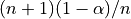
We use a two-dimensional dataset with three labels. The distribution of the data is a bivariate normal with diagonal covariance matrices for each label.
# Reference:
# Mauricio Sadinle, Jing Lei, and Larry Wasserman.
# "Least Ambiguous Set-Valued Classifiers With Bounded Error Levels."
# Journal of the American Statistical Association, 114:525, 223-234, 2019.

from typing import List

import matplotlib.pyplot as plt
import numpy as np
from sklearn.model_selection import train_test_split
from sklearn.naive_bayes import GaussianNB

from mapie._typing import NDArray
from mapie.classification import MapieClassifier
from mapie.metrics import (classification_coverage_score,
                           classification_mean_width_score)

centers = [(0, 3.5), (-2, 0), (2, 0)]
covs = [np.eye(2), np.eye(2) * 2, np.diag([5, 1])]
x_min, x_max, y_min, y_max, step = -6, 8, -6, 8, 0.1
n_samples = 500
n_classes = 3
np.random.seed(42)
X = np.vstack(
    [
        np.random.multivariate_normal(center, cov, n_samples)
        for center, cov in zip(centers, covs)
    ]
)
y = np.hstack([np.full(n_samples, i) for i in range(n_classes)])
X_train, X_cal, y_train, y_cal = train_test_split(X, y, test_size=0.3)

xx, yy = np.meshgrid(
    np.arange(x_min, x_max, step), np.arange(x_min, x_max, step)
)
X_test = np.stack([xx.ravel(), yy.ravel()], axis=1)
Let’s see our training data
colors = {0: "#1f77b4", 1: "#ff7f0e", 2: "#2ca02c", 3: "#d62728"}
y_train_col = list(map(colors.get, y_train))
fig = plt.figure()
plt.scatter(
    X_train[:, 0],
    X_train[:, 1],
    color=y_train_col,
    marker="o",
    s=10,
    edgecolor="k",
)
plt.xlabel("X")
plt.ylabel("Y")
plt.show()
We fit our training data with a Gaussian Naive Base estimator.
Then we apply MapieClassifier in the
calibration data with the methods "lac" and "aps"`
to the estimator indicating that it has already been fitted with
cv=”prefit”.
We then estimate the prediction sets with differents alpha values with a
fit and predict process.
clf = GaussianNB().fit(X_train, y_train)
y_pred = clf.predict(X_test)
y_pred_proba = clf.predict_proba(X_test)
y_pred_proba_max = np.max(y_pred_proba, axis=1)

methods = ["lac", "aps"]
mapie, y_pred_mapie, y_ps_mapie = {}, {}, {}
alpha = [0.2, 0.1, 0.05]
for method in methods:
    mapie[method] = MapieClassifier(
        estimator=clf,
        method=method,
        cv="prefit",
        random_state=42,
    )
    mapie[method].fit(X_cal, y_cal)
    y_pred_mapie[method], y_ps_mapie[method] = mapie[method].predict(
        X_test, alpha=alpha, include_last_label=True,
    )
MAPIE produces two outputs:
y_pred_mapie: the prediction in the test set given by the base estimator.
y_ps_mapie: the prediction sets estimated by MAPIE using the selected method.
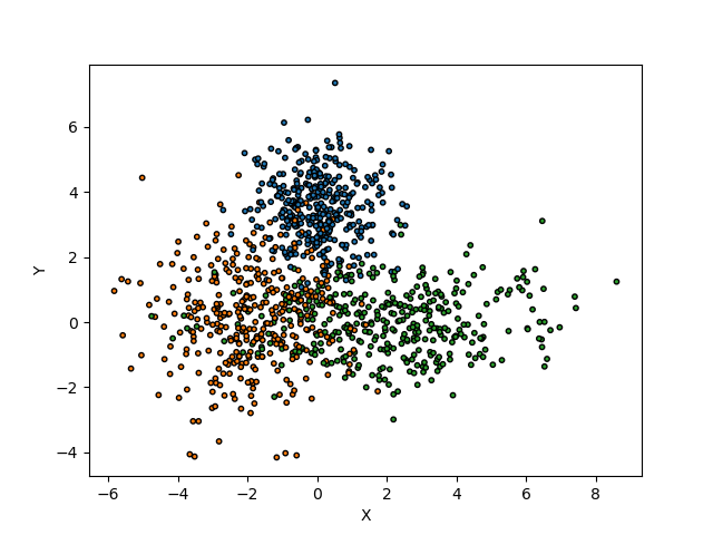
Let’s now visualize the distribution of the conformity scores with the two methods with the calculated quantiles for the three alpha values.
def plot_scores(
    alphas: List[float],
    scores: NDArray,
    quantiles: NDArray,
    method: str,
    ax: plt.Axes,
) -> None:
    colors = {0: "#1f77b4", 1: "#ff7f0e", 2: "#2ca02c"}
    ax.hist(scores, bins="auto")
    i = 0
    for quantile in quantiles:
        ax.vlines(
            x=quantile,
            ymin=0,
            ymax=500,
            color=colors[i],
            linestyles="dashed",
            label=f"alpha = {alphas[i]}",
        )
        i = i + 1
    ax.set_title(f"Distribution of scores for '{method}' method")
    ax.legend()
    ax.set_xlabel("scores")
    ax.set_ylabel("count")


fig, axs = plt.subplots(1, 2, figsize=(10, 5))
for i, method in enumerate(methods):
    conformity_scores = mapie[method].conformity_scores_
    n = mapie[method].n_samples_
    quantiles = mapie[method].quantiles_
    plot_scores(alpha, conformity_scores, quantiles, method, axs[i])
plt.show()
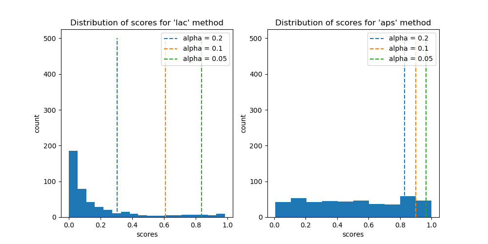
We will now compare the differences between the prediction sets of the different values of alpha.
def plot_results(
    alphas: List[float], y_pred_mapie: NDArray, y_ps_mapie: NDArray
) -> None:
    tab10 = plt.cm.get_cmap("Purples", 4)
    colors = {
        0: "#1f77b4",
        1: "#ff7f0e",
        2: "#2ca02c",
        3: "#d62728",
        4: "#c896af",
        5: "#94a98a",
        6: "#8a94a9",
        7: "#a99f8a",
        8: "#1e1b16",
        9: "#4a4336",
    }
    y_pred_col = list(map(colors.get, y_pred_mapie))
    fig, [[ax1, ax2], [ax3, ax4]] = plt.subplots(2, 2, figsize=(10, 10))
    axs = {0: ax1, 1: ax2, 2: ax3, 3: ax4}
    axs[0].scatter(
        X_test[:, 0],
        X_test[:, 1],
        color=y_pred_col,
        marker=".",
        s=10,
        alpha=0.4,
    )
    axs[0].set_title("Predicted labels")
    for i, alpha_ in enumerate(alphas):
        y_pi_sums = y_ps_mapie[:, :, i].sum(axis=1)
        num_labels = axs[i + 1].scatter(
            X_test[:, 0],
            X_test[:, 1],
            c=y_pi_sums,
            marker="o",
            s=10,
            alpha=1,
            cmap=tab10,
            vmin=0,
            vmax=3,
        )
        plt.colorbar(num_labels, ax=axs[i + 1])
        axs[i + 1].set_title(f"Number of labels for alpha={alpha_}")
    plt.show()


for method in methods:
    plot_results(alpha, y_pred_mapie[method], y_ps_mapie[method])
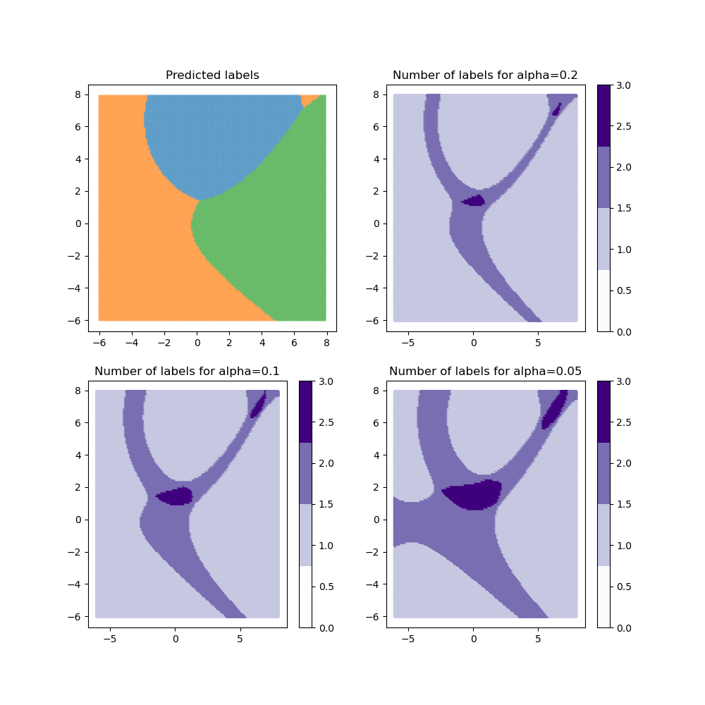
For the “lac” method, when the class coverage is not large enough, the prediction sets can be empty when the model is uncertain at the border between two labels. These null regions disappear for larger class coverages but ambiguous classification regions arise with several labels included in the prediction sets. By definition, the “aps” method does not produce empty prediction sets. However, the prediction sets tend to be slightly bigger in ambiguous regions.
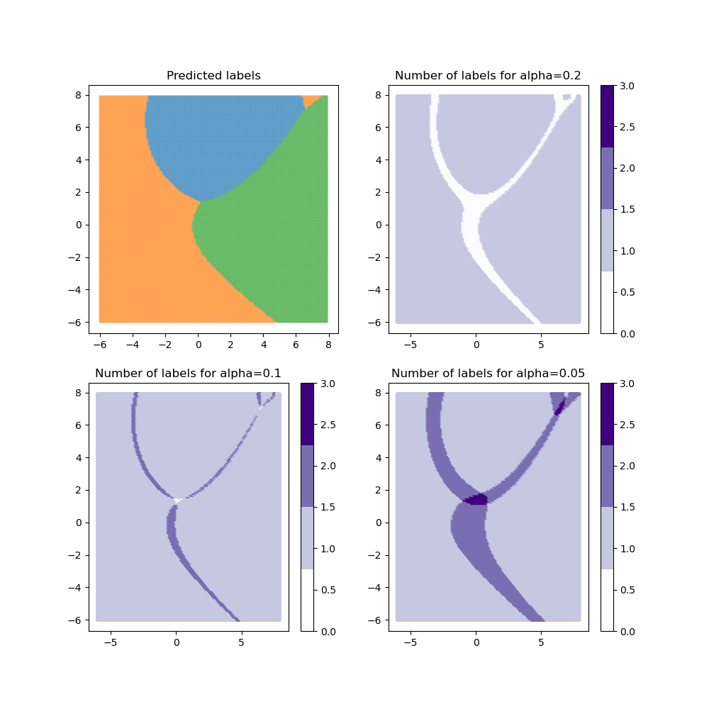
Let’s now compare the effective coverage and the average of prediction set
widths as function of the  target coverage.
alpha_ = np.arange(0.02, 0.98, 0.02)
coverage, mean_width = {}, {}
mapie, y_ps_mapie = {}, {}
for method in methods:
    mapie[method] = MapieClassifier(
        estimator=clf,
        method=method,
        cv="prefit",
        random_state=42,
    )
    mapie[method].fit(X_cal, y_cal)
    _, y_ps_mapie[method] = mapie[method].predict(
        X, alpha=alpha_, include_last_label="randomized"
    )
    coverage[method] = [
        classification_coverage_score(y, y_ps_mapie[method][:, :, i])
        for i, _ in enumerate(alpha_)
    ]
    mean_width[method] = [
        classification_mean_width_score(y_ps_mapie[method][:, :, i])
        for i, _ in enumerate(alpha_)
    ]

fig, axs = plt.subplots(1, 3, figsize=(15, 5))
axs[0].set_xlabel("1 - alpha")
axs[0].set_ylabel("Quantile")
for method in methods:
    axs[0].scatter(1 - alpha_, mapie[method].quantiles_, label=method)
axs[0].legend()
for method in methods:
    axs[1].scatter(1 - alpha_, coverage[method], label=method)
axs[1].set_xlabel("1 - alpha")
axs[1].set_ylabel("Coverage score")
axs[1].plot([0, 1], [0, 1], label="x=y", color="black")
axs[1].legend()
for method in methods:
    axs[2].scatter(1 - alpha_, mean_width[method], label=method)
axs[2].set_xlabel("1 - alpha")
axs[2].set_ylabel("Average size of prediction sets")
axs[2].legend()
plt.show()
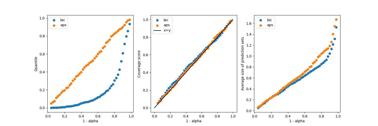
It is seen that both methods give coverages close to the target coverages,
regardless of the value. However, the “aps”
produces slightly bigger prediction sets, but without empty regions
(if the selection of the last label is not randomized).
Total running time of the script: ( 0 minutes 3.471 seconds)